As an international author, I am continually amazed at the covers by WhiteFire Publishing. I simply had to share the design process from Roseanna White's own blog on how she created these breathtaking covers showing exotic India. Thank you so much Roseanna White.
Remember When . . . The Series Was Complete? By Roseanna White as previously published on Writing Roseanna
WhiteFire's first series to be contracted and completed just got its final cover. The Twilight of the British Raj has won some awards and garnered a lot of very well-deserved praise. And when Christine Lindsay (the author) and I started chatting covers for the final installment, Veiled at Midnight, I think we were both rubbing our hands together in delight.
The first book of the series took place in British India of 1919. It was one of WhiteFire's first two titles other than mine, and at that point, I was not designing covers. We hired the amazing George of Tekeme Studios, and he blew us away with this fabulous cover for Shadowed in Silk.
By the time book 2, Captured by Moonlight, rolled around, I had wet my feet in the design world, and Christine and I discussed it and agreed I'd try my hand at mimicking the style of the first with the images we had in mind for the second.
This third book jumps a generation. Set during the tumultuous partitioning of India and Pakistan in the 1940s, our hero and heroine are Cam, the little boy from the first book, and Dassah, who was a baby in the first book. I haven't yet gotten my hands on the MS, but I know what an amazing writer Christine is, and I know we're in for another sweeping saga of romance and suspense!
Christine started a Pinterest page for the book, which is where our idea-gathering began. She wanted gold on the cover, to represent the joy of a new dawn. Though "midnight" is in the title (the Partition took effect at midnight), she wanted the images to represent a new day. (Not to mention we already had a night scene on cover 2...)
Our first thought was to use green and gold, to represent the Pakistan flag. The most compelling images we found were of a night sky, and my (very very very very very sloppy) playing around led to this.
Not bad. The lighting in that sky is amazing. But the original image of the model had her in a red sari, and changing red to gold is T-O-U-G-H. I managed a fair imitation with the low-resolution comp I downloaded from Shutterstock, but I knew it would be much harder with the real photo. So I was pretty happy when Christine emailed and said that her critique partner convinced her that red might be okay. It was a color Dassah had shied away from in the earlier part of the book, because it reminded her too much of all the blood that had been spilt. But they decided that later in the book, she could instead realize it also represented the blood of salvation.
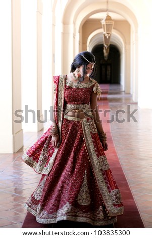
So we began with this model picture from Shutterstock. We both loved the pose, and I especially loved the motion in the sari.
Obviously, next we take out the background.
Now, you'll notice that in this traditional sari, the belly is showing. This is accurate, both today and historically, but we decided that for a CBA book, we probably shouldn't have the bare flesh. So I inserted a semi-transparent layer to mimic sheer fabric there.
Now it was time for the background. There are some absolutely GORGEOUS images of India that we considered. I knew the characters spend some time at a mountain lake, and I knew we wanted gold tones, so I decided to try out this one.
A good start. I liked the colors together, and the water. But I wasn't wild about how distinct that building is in the back. And Christine pointed out (later, but let's show the change now, LOL), that the light is hitting her on the wrong side. So I flipped her.
To blur the background in the distance, but not the water up close--because I LOVE that reflection--I duplicated the layer, blurred the top one, and then applied a layer mask and faded the top image from the bottom of the screen upward--that way, the bottom layer comes through in its non-blurred glory toward the lower portion and fades into the blurred image at the top.
Pretty, yes? But not there yet. The covers for this series are rich with texture layers. So to get the full effect and really see if it was going to give me the look I was going for, I first added in the elements that would stay the same as the first books (but with color changes)--the one I call "the lotus thingy" and the "banner thingy" that goes behind the title.
Oo, I was starting to like how this was coming together! I went ahead and added the title. Which, for these books, includes the title itself, then the last word faded out behind it in an exotic looking font.
Okay, so now I had a great base. I loved where it was going, I loved the way the red and the gold worked together. But now I needed to add some texture.
In the first cover, Tekeme had used a flower overlay that I liked but couldn't match exactly. So for book 2, I used a paisley design. For this one, I wanted something altogether different. So I did a search for "photoshop texture lotus gold" (don't you love the random words you can put together for searches? LOL) and I found this one.
It just felt promising from the get-go, LOL. So I plopped it down on the top, set the layer opacity way down, and used my fade-out gradient to make the middle of the layer completely transparent.
Oh my. Yes. This was the point where my breath got all knotted up in my throat, and I knew I'd found my look. I went ahead and added the layer with Christine's name, making it red. But that layer is also always textured, so I duplicated my texture layer, shrank it down, and this time didn't fade it out. The result was this, and I gotta say, silly as it is, that's it's one of my favorite elements on this whole cover, LOL.
So I added that, and also the series name where it belonged. And I was happy. Almost. Mostly.
There was just one thing missing--a border. Each of the other two covers have a border, just a slightly-darker version of itself. I needed something like that here, but I didn't want to mess with what I had already, so I nearly left it off.
Then I looked at the original texture layer again. And I noticed that it had really cool sides that were not on my cover because I wanted the lotus part to extend off in both directions. How to get those on as the border, without interfering with the nice transparency of the original texture layer? Well, I fiddled with it until I figured out the obvious answer. I pasted it on, narrowed it to fit the width of the book, and then deleted everything accept that border part that I wanted. And voila!
And there we have it. The real, honest-to-goodness finished version of the front. (Haven't created the back yet.) I was fairly giddy with it, so showed it to hubby/publisher David, who said, "Wow. Yeah. That's it."
So I emailed it to Christine, who said, "CAN I SHOW THIS OFF?" ;-)
I emailed it to best friend/crit partner Stephanie, who said, "I think this might be my favorite of all your designs!"
I don't pick favorites, LOL. But I do adore this cover. I like the continuity with the other books in the series, but I also like where it's different. I feel like this one was somehow more my design and less trying to mimic that first cover. And I just adore those colors together. So overall, we're all very pleased. =) The Twilight of the British Raj will finish up in style!
CONNECT WITH AUTHOR CHRISTINE LINDSAY ON Facebook, Twitter, Pinterest, Goodreads, or on her blog www.christinelindsay.org


WOW! Christine and Roseanna what a stunning post. Roseanna you are one TALENTED lady. I love what you have both come up with and you're right. These three covers are stunning, but I have to say my favourite (and I AM allowed favourites, 'cos they're not my book!) is this latest one. Amazing.
ReplyDeleteI love the 'behind the scenes' look at book covers. Fantastic job and very interesting to see how it comes together.
ReplyDeleteWhat an interesting post and the book cover is stunning! Thank you for sharing the process with us,
ReplyDeleteIt is exciting to see the front cover encompass our books, isn't it. Especially nice to work with a publisher who lets the author share her vision, and even participate in the design.
ReplyDeleteIt is exciting that the publisher let you share the vision, Christine, and the result is spectacular.
ReplyDeleteLove this post, and love the richness of this cover. I think it's my fave, but Shadowed's cover is also really gorgeous.
ReplyDeleteAnd of course with the first two covers, the models are my daughters.
ReplyDeleteThe whole way this came to be is absolutely stunning! Its creation was a fascinating story in itself. A real work of art. Brilliant, Roseanna, and how exciting for you, Christine. This has just set a very very high standard for covers. Thanks for sharing, girls. LOVED IT.
ReplyDeleteFantastic Cover!!!
ReplyDeleteChristine, I love your cover! Thanks for sharing the fascinating cover creation process. Roseanna is talented :)
ReplyDeleteChristine, this cover is amazing. I am definitely keeping this blog as reference :) I love making mock covers before I start writing something new, and this will help me to do that more professionally. Well done to all involved!
ReplyDeleteOh wow!! That cover is amazing! Thank you for sharing the process. I'd buy that book just based on the cover alone. :) Well done! :)
ReplyDeleteI love the cover its so pretty and fits so well. looking forward to this story. Thanks for sharing how the cover was made.
ReplyDeleteAbsolutely amazing process! Gorgeous cover!
ReplyDeleteWow so interesting to see the process and what a great cover at the end. You must be so thrilled, Christine!
ReplyDeleteThanks everyone, I was pretty giddy just like Roseanna White when she created this. Love it. Now I have to finish the book. Yikes.
ReplyDeleteChristine, I loved seeing how this cover was designed. It's a gorgeous cover!
ReplyDelete